Introduction
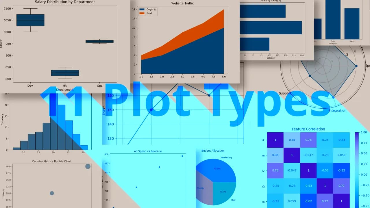
Dashboards are only as useful as the clarity of the data they present. Choosing the right type of chart can make or break the user’s understanding of your product or dataset. In this post, we’ll explore 11 essential chart types that frequently appear in dashboards, explain when to use them, and provide a Python code snippet to help you generate each one using either matplotlib or seaborn.
1. Line Chart
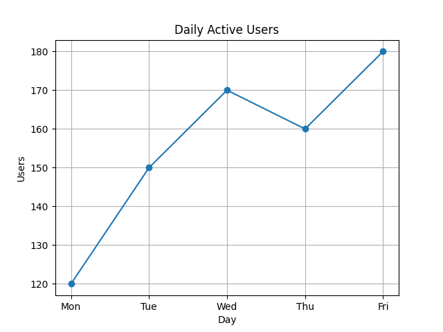
Line charts are ideal for visualizing data points over time. They’re commonly used in dashboards to show trends, such as daily active users, monthly revenue, or stock prices. This chart makes it easy to identify upward or downward movements and patterns.
Use Case: Visualizing daily active users over the past week.
pythonimport matplotlib.pyplot as plt
days = ["Mon", "Tue", "Wed", "Thu", "Fri"]
users = [120, 150, 170, 160, 180]
plt.plot(days, users, marker='o')
plt.title("Daily Active Users")
plt.xlabel("Day")
plt.ylabel("Users")
plt.grid(True)
plt.show()
2. Bar Chart
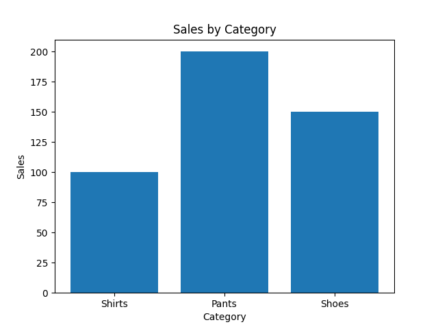
Bar charts are used to compare discrete categories. Think of comparing sales across different product categories, counts of user types, or bug reports per team. They’re very common in admin and e-commerce dashboards.
Use Case: Sales by product category.
pythoncategories = ["Shirts", "Pants", "Shoes"]
sales = [100, 200, 150]
plt.bar(categories, sales)
plt.title("Sales by Category")
plt.xlabel("Category")
plt.ylabel("Sales")
plt.show()
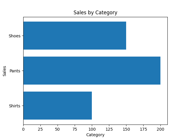
3. Column Chart (Vertical Bar)
Functionally the same as a bar chart but with vertical orientation. Use plt.bar() for vertical columns and plt.barh() for horizontal bars. The choice depends on what fits better in your layout and labels.
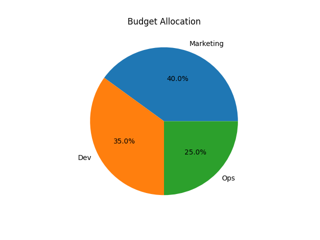
4. Pie Chart
Pie charts show how a whole is divided among parts. They’re best used when you want to highlight proportional breakdowns, like budget allocation or percentage of users by platform.
Use Case: Showing how a company’s budget is split across departments.
pythonlabels = ['Marketing', 'Dev', 'Ops']
sizes = [40, 35, 25]
plt.pie(sizes, labels=labels, autopct='%1.1f%%')
plt.title("Budget Allocation")
plt.show()
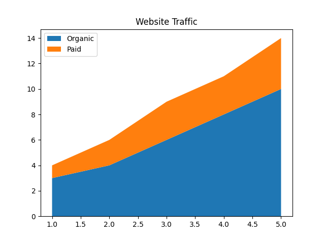
5. Area Chart
Area charts help visualize cumulative values over time. They’re especially useful when comparing multiple series, such as traffic sources or revenue streams, and you want to emphasize the total volume.
Use Case: Tracking website traffic from different sources.
pythonimport numpy as np
x = np.arange(1, 6)
y1 = np.array([3, 4, 6, 8, 10])
y2 = np.array([1, 2, 3, 3, 4])
plt.stackplot(x, y1, y2, labels=['Organic', 'Paid'])
plt.legend(loc='upper left')
plt.title("Website Traffic")
plt.show()
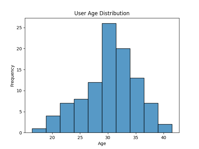
6. Histogram
Histograms are perfect for showing distributions—how often values fall into certain ranges. They’re often used in analytics dashboards to show user age distributions, session durations, or load times.
Use Case: Age distribution of users.
pythonimport seaborn as sns
import numpy as np
ages = np.random.normal(loc=30, scale=5, size=100)
sns.histplot(ages, bins=10, kde=False)
plt.title("User Age Distribution")
plt.xlabel("Age")
plt.ylabel("Frequency")
plt.show()
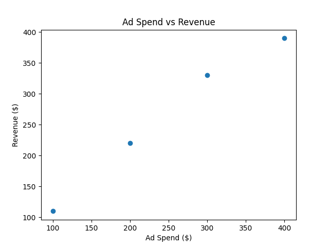
7. Scatter Plot
Scatter plots are great when you want to explore relationships between two numerical variables. These are helpful in analytics dashboards where trends or correlations are being monitored.
Use Case: Correlation between ad spend and revenue.
pythonspend = [100, 200, 300, 400]
revenue = [110, 220, 330, 390]
plt.scatter(spend, revenue)
plt.title("Ad Spend vs Revenue")
plt.xlabel("Ad Spend ($)")
plt.ylabel("Revenue ($)")
plt.show()
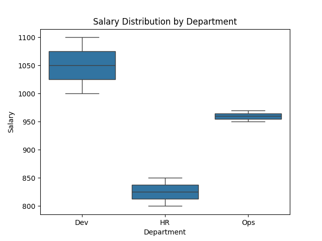
8. Box Plot
Box plots (a.k.a. box-and-whisker plots) are used to display the distribution of a dataset and identify outliers. In dashboards, they’re often seen in HR or finance sections for things like salary ranges.
Use Case: Comparing salaries across departments.
pythonimport pandas as pd
import seaborn as sns
# Example data
data = pd.DataFrame({
"Department": ["Dev", "Dev", "HR", "HR", "Ops", "Ops"],
"Salary": [1000, 1100, 800, 850, 950, 970]
})
sns.boxplot(x="Department", y="Salary", data=data)
plt.title("Salary Distribution by Department")
plt.show()
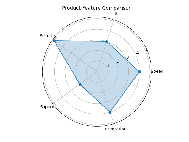
9. Radar Chart
Radar charts are used to compare multiple variables for different items. They often appear in product comparisons, performance scoring, or skill assessments. They’re eye-catching but should be used sparingly.
Use Case: Comparing product features.
pythonfrom math import pi
labels = ['Speed', 'UI', 'Security', 'Support', 'Integration']
values = [4, 3, 5, 2, 4]
num_vars = len(labels)
angles = [n / float(num_vars) * 2 * pi for n in range(num_vars)]
values += values[:1] # repeat first value to close the circle
angles += angles[:1]
plt.polar(angles, values, marker='o')
plt.fill(angles, values, alpha=0.25)
plt.xticks(angles[:-1], labels)
plt.title("Product Feature Comparison")
plt.show()
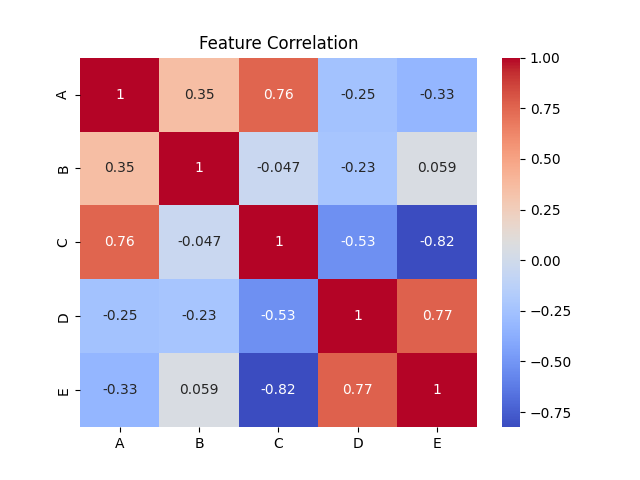
10. Heatmap
Heatmaps are used to show magnitude with color in matrix-like data. You’ll often see them in analytics tools to display correlation matrices, engagement across hours and days, or feature usage.
Use Case: Viewing correlations between multiple features.
pythonimport numpy as np
import seaborn as sns
import pandas as pd
# Example data
corr_data = pd.DataFrame(np.random.rand(5, 5), columns=list('ABCDE'))
corr = corr_data.corr()
sns.heatmap(corr, annot=True, cmap="coolwarm")
plt.title("Feature Correlation")
plt.show()
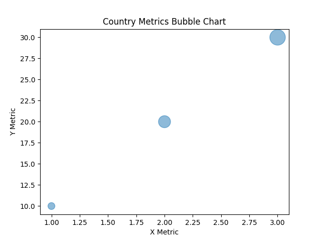
11. Bubble Chart
Bubble charts are a variation of scatter plots where each point’s size represents an additional dimension. They’re useful when comparing three variables at once, such as population, GDP, and literacy rate.
Use Case: Comparing countries by income, population, and GDP.
pythonx = [1, 2, 3]
y = [10, 20, 30]
sizes = [100, 300, 500]
plt.scatter(x, y, s=sizes, alpha=0.5)
plt.title("Country Metrics Bubble Chart")
plt.xlabel("X Metric")
plt.ylabel("Y Metric")
plt.show()
Conclusion
Choosing the right chart type helps make complex data easier to digest and act upon. With Python and libraries like matplotlib and seaborn, visualizing your data becomes quick and flexible. Try out the code snippets, tweak them to your needs, and build your own intuitive dashboards!
Album of the day: